How to Improve UX with Voice of Customer
Steve Jobs once said that people do not know what they want until they see it, and Henry Ford heard people say “faster horses”, so he designed Ford Model T, ignoring what people want and giving them what they need. Yeah, but what about the fact that more often than not people actually do know what they need?
Not all of us can afford the luxury of being able to hear the voice of our customers and users, but it is an incredibly valuable source of crucial insights. In addition, we tend to become numb to our projects and sometimes we do not notice blatant mistakes, so external feedback efficiently clears our mental cache.

If you are exposed to stuff like this daily, your brain becomes numb.
People happen to be perfectly capable of pointing out their pain points, especially when they are painful enough. That is why I’ll tell you about ways how you can use the voice of customer and how you can get UX value out of it. The most obvious and the best suggestions often come from the users themselves.
Life Experiences
I’ll speak from my experience with a design agency offering usability improvements to their clients. The agency used our tools to help their client improve their website. The website unfortunately didn’t support Responsive Web Design, the call to actions were unclear, and the navigation was confusing enough that users probably expected to find a minotaur between the maze-like menus.
The agency came up with Card Sorting studies and Surveys, and asked people to provide their opinion about specific elements of the website. They tested the effectiveness of the CTAs and even measured how likeable certain colour combinations were. The opinions varied, but they were conclusive enough that the agency was ready to change the copy accordingly and even increase the contrasts of the design on the website. Moreover, they improved the navigation structure of the website according to the data they gathered from the studies on their users.
The results of studying the feedback were largely positive. Users surveyed after the improvements claimed they enjoyed their experience with the website, and considered it more readable and pleasant to use. The conversion rates also increased by almost 200%, which was the tangible proof.
Sujan Patel, VP of Marketing at When I Work speaks of his experiences, how they properly applied the rules of listening to the customers. He started by using a survey for their website visitors and free trial users, and asked them what the obstacle was in the buying process.
Surveyed audience claimed that they are not being educated well enough by the service, that is why guys at When I Work improved their onboarding process, the setup guide documentation and created a new interactive setup wizard, improving the experiences of their users.
The second step was to use the live chat instead of surveys – Sujan Patel talked with his users and visitors and asked them about the copy of the website. He learned that the way people refer to their service differently than When I Work refers to themselves in their copy. Instead of testing hundreds of messages as they used to, When I Work focused on two messages: “scheduling made easy” and “best scheduling app”.
The last step was to talk with customers about their experiences. Sujan Patel learned that those who attended a webinar first provided a 47% higher LTV (lifetime value). With that knowledge, When I Work started incentivizing people to join webinars by giving them a free month for attending.
The results of using customer feedback were three times higher click-through rates and lower cost-per-click by 50%. Of course, this is strictly related to conversion, but such stats advocate another purpose – proper User Experience leads to higher success rates at your website.
It Ain’t Gonna Be Pretty
Once you saw the value, a warning first: if you decide to use a Customer Feedback tool, you won’t hear nice things. This is who we are – people are ready to point out what is wrong instead of giving praise.
However, it isn’t a reason to cry about – you should actually be happy. Instead of spending hours on looking for bugs or areas that need improvement, your customers will tell you right away what bugs them.
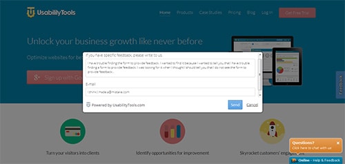
The Moebius strip of Customer Feedback.
According to the White House Office of Customer Affairs, only one person per 26 customers bothers to speak up. It means that all feedback you receive is gold, and there is a high chance many other people complain on the same issues – you simply do not know about them.
“Customers don’t expect you to be perfect. They do expect you to fix things when they go wrong.”
If you fix problems quickly and efficiently, users are more likely to remember the good out of the bad, especially if it’s in their favour (maybe a discount?). Make sure to work on the negative feedback, as it is one of the best ways of efficiently improving User Experience. You are not just removing an issue – you are introducing an improvement as well.
Start Early
Don’t wait too long to begin gathering feedback – the sooner you start, the better. If the project is at early stages, you can quickly determine which elements in the basic framework are faulty. There are many prototyping tools for setting up simple and shareable projects, and you can check their effectiveness with various tools, for example Click Testing – you don’t need a working prototype but just a screenshot to do it, after all.
Remember to expand your survey so it targets as many groups as possible as well. Also, be sure to formulate properly the questions you will be asking, so you won’t receive biased results. There’s no point in simply asking “you like/you don’t like”, as you need to understand the processes behind the decisions of your users.
Reiterating your project using feedback is a good way to eliminate problems in the earliest stages, thus delivering a satisfying product later. You will need less testing later (but you’ll still need to test, though!)
Combine
Listening to what people say is a great source of information on what to improve on your website, too. However, you can pair it with certain UX studies in order to increase its effectiveness. For example, take aforementioned screenshot click testing and combine it with a survey – people react stronger to imagery, and it is better for them to judge visible designs instead of questions.
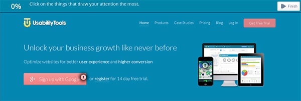
A sample click-tracking study.
Instead of bluntly asking “What do you find irritating about our website”, try to pair it with a click-testing tool and ask “What do you find irritating about our website shown below”, and show an image featuring the surveyed website. This way you will ensure genuine responses.
Let People Know They Helped
It is a seemingly small tip, but it can have great results – once you’ve conducted a study and figured out that you can introduce good improvements based on the feedback, let your users know about that, for two good reasons:
- Firstly, they will feel acknowledged and appreciated as they learn that their input was actually valuable.
- Secondly, they will be actually curious to see how they influenced the changes, so they will be eager to return, even if just for a look.
And who knows, maybe the improvement you made is so crucial to their satisfaction that they might change their mind and join your service after all.
The Finish Line
Customer Feedback is one great resource for all User Experience designers – they design for people, after all. We tend to assume we know better, but it’s great to receive feedback from other sources as well so we have a broader perspective over our projects.
Your customers, visitors, or users can save you lots of time in creating improvements for your website. Simply ask them and you will see pearls of knowledge that you might not come up with otherwise.





No responses yet to “How to Improve UX with Voice of Customer”