The Secret to an Eye Catching Web Design: Going the Extra Mile
It will be no surprise to those of us who work in the web industry that standards are incredibly high these days. More and more people are turning their hand to web design and that makes the competition for creating a breathtaking design as difficult today as it’s ever been. So how can we make the websites we create stand out in a very busy crowd?
I think the website is fine the way it is
This comment is one I’m sure we have all heard many times. In some industries creating something to a level that peaks at “fine” might be all that’s needed. However, if you want your website to be a success and actually catch the attention of your intended audience, then the “fine” attitude really isn’t going to cut it.
A few years ago, usability wasn’t as important to web design as it is today. Developers created websites to fulfill a purpose, and over the years design gradually started to become an important element. The problem is the same way of thinking is still seen in today’s websites. This can become a real issue with web performance, especially in eCommerce sites. Common usability mistakes are still seen in modern websites, mistakes that can easily be fixed or removed. Some of the most common old-school usability mistakes still seen today are small or hidden buttons, bloated text, lack of social media and the dreaded non responsive layout.
The first stage of tackling any problem is admitting there is one. By simply comparing your site to others in the same industry, can be the quickest and easiest way to decide if your design is up to scratch. Comparing layout, elements, the user journey and even the colour palette can really make you view your own design in a whole new light. It is also worth noting that while researching other websites can be a quick and easy way to stay ahead of the competition, it does not excuse plagiarism.
Comparing your current website to others can be a difficult step, especially to those of us who have trouble accepting criticism. However, the big picture of achieving a high web performance is more important. If your website is merely acceptable and your competitor’s is wonderful, then chances are you will not get the traffic you want. This same principle can be applied to well known clothes stores. A shopper will walk past a store with a hidden entrance and a dull look to instead spend their money in a store that catches their eye, welcomes them in and displays it’s products in a clear manner.

A shopper will walk past a store with a hidden entrance and will shop somewhere else.
Brush up on modern web design trends
In any industry the key to staying ahead of the game is to know what the competition is up to. As sinister and menacing as that sounds however, the practice of seeing what others are doing in the web industry is quite civilised, and in fact encouraged. Designers and developers love sharing their work with their fellow peers, showing off elements they have created and thought up. It is this ritual of consistently browsing through modern design techniques and development nuggets that keeps any web person up to scratch.

Designers and developers work together to follow the latest web design trends.
One of the best sites that showcases ultra modern websites is Awwards.com. Creating a sense of competition is something we web enthusiasts love, and the websites submitted here are of the highest quality, both in terms of design and development.
It also helps to read up on articles about designs trends for 2014/2015. Some trends have been about for the past few years and continue to grow, e.g. responsiveness and flat design. However every year new practices come out of the woodwork, some of which will become default before you know it, such as personalised user experiences and infinite scrolling.

Infinite scrolling – Image by Design Shack.
Be prepared to invest time and effort
Remember the old saying “Rome wasn’t built in a day”? Well the same principle can be applied to the web industry. After all, Google and Facebook didn’t just pop out of the snow either. Creating a quality website is like building your own home, you don’t rush into it and you don’t cut corners if you want it to stand on its own.
The difference between dull, boring and all together “meh” websites compared to bright, shiny, exciting ones all comes down to one important factor – the detail. Details can turn a bland, vanilla website into something clever, intriguing and one to remember.

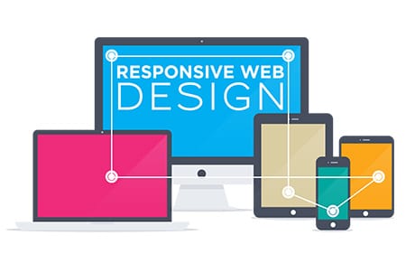
Responsive Design – Image by Duda Blog.
However it is well known to anyone who has worked in this industry for more than 2 days that life is not always perfect. Your coffee will not always be hot, your computer will freeze at the worst time and you will not always get to launch the site you planned for, often due to time constraints. It is perhaps the one factor of the web industry everyone can agree on and relate to.
It is however something we rarely can control and usually have to do the best work with what we have. That is not to say though that limited time gives designers and developers a free pass to coast until the website is completed. It is our job to create the best we can with what we have, and even the most rushed of websites can have a well designed look and feel as well as a smooth user experience.

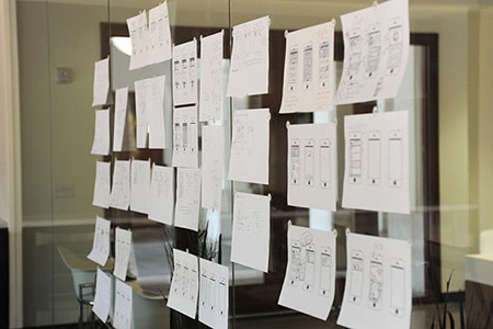
Wireframing by hand – Image by Fast Code Design.
When a new website is discovered and shared among friends and workers, you could pretty much guarantee is has something special and unique that makes it stand out from the endless sea of website clones. It could be the menu animation, the unique font, the transitions between pages, or even the style of photographs. Details can make anything go from simply ordinary to simply stunning, and with a market lace as tough and competitive as the web industry, its pays to put the effort in.


Great article!
Really good article! Loved the variety of suggestions and how the author seems to know the industry!
Hey Grainne. I appreciate you taking the time to write this article. I am always looking at different ways to captivate the eyeballs on my website. I like what you spoke about regarding the usability and responsiveness of websites, as well as, mobile friendly. I make a lot of sells in my area because a lot of my clients do not have mobile friendly, nor responsive websites. Thanks for sharing the trendy site as well. I am unfamiliar with them, but this gives me a little bit of homework.
Thanks for using this useful information for good web design, Keep it Up.