Persuasive Menu Cards
A restaurant visit is sometimes more expensive than what you had in mind. Smart restaurant owners use little persuasive tricks to gain more profit per single visit. Professor in Experimental Psychology Charles Spence investigated some of these strategies and found eight tricks.
The First Look
Research has shown that we spend more time looking at the upper right hand corner of a menu card than the bottom left. By placing meals with the highest profit margin into the upper right corner, restaurant owners guide us to the dishes which have been picked out for us.
The Decoy Effect
I already wrote about the decoy effect on online pricing tables, but this phenomenon is also being used in a menu card. Adding a very expensive meal to the menu, makes the other dishes seem cheaper.
This goes the same for wine lists. People often order the second cheapest wine on the list and not the cheapest because they don’t want to look too stingy. Most of the time, the second cheapest wine is the one that has the highest profit margin.
Layout
The layout plays a big role as well. By central aligning the text of the menu, and not right aligning it, restaurant owners deliberately decrease the readability. The result is that diners are having trouble comparing prices of each dish. On top of that, Charles Spence found out that by central aligning the text on the menu, people pick the more expensive dishes over the cheaper ones.
Taking out the currency sign ($,€,£,…) has an impact on the amount of what people spend on a restaurant visit.
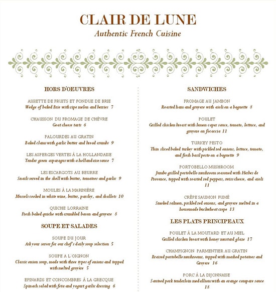
Decreasing the readability by central aligning the text, makes it more difficult for people to compare the dishes. People tend to pick out the more expensive dishes over the cheaper ones.
Music: Part 1
The surroundings, more specifically music, influences the spending pattern as well. A restaurant serves French and German wine and let’s assume that French wine is more expensive than the German one. By playing French music in the background, people show a tendency to choose the French wine over the German wine.
Music: Part 2
Research conducted by the University of Leicester, has shown that classical music (which is being associated with the “more privileged people”) encourages diners to spend more. Playing no music at all has a negative effect on spending money.
Waiter/Waitress
Another big influencer is the waiter. The better he’s selling a certain wine or dish, the less people would ask for the price. A second point is that a visitor, who is in the company of others, often feels too ashamed to ask for the price.
Their is one last thing I’d like to point out. The order in which the different dishes are summed up by the waiter. It actually influences the decision making as well. The first dishes or wines are vaguely remembered while the last ones are picked out more often.
Extra bottles
When waiters pour drinks continuously throughout the meal – causing an half emptied bottle halfway – diners tend to buy a second bottle more often.
Color and touch
I wrote quite some articles about color psychology in the past and this is another perfect example. According to a French study, waitresses wearing red clothes make bigger tips.
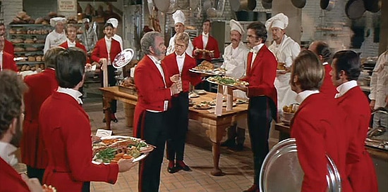
Jim Hutchinson ‘Stanley’ red and black waiter outfit from Hello, Dolly!
Also, research has shown that touching someones hand or shoulder has a positive effect on tips as well. It is called the “Midas Touch Effect” which is an analogy for the king from the Greek mythology who changed everything to gold just by touching it.
The Perfect Meal: The Multisensory Science of Food and Dining – by Charles Spence
The Perfect Meal examines all of the elements that contribute to the diner’s experience of a meal (primarily at a restaurant) and investigate how each of the diner’s senses contributes to their overall multisensory experience.




It’s funny, because they spend a lot of money for more sell, they do research, but can’t spend money for a correct french menu card. All about credibility :/