The Importance of A/B Testing
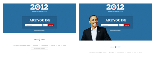
Lately, you may have heard a lot of buzz about A/B Testing. This is no small part thanks to the central role to approach played in Obama’s successful presidential bid as a part of a grassroots marketing and fundraising effort.
Google, Amazon, eBay and the BBC are also big fans, making this the hit term of the day. But just what is A/B testing and how can you implement it into your greater marketing efforts? Let’s take a look.
Why is A/B testing important?
You can build a website that looks great. You can populate a sales email with finely crafted prose. You can even begin to measure the effectiveness of your efforts by taking a good look at your Google Analytics dashboard to determine just how many people are perusing your materials, how they got there, and with what content they engaged. But you just can’t know if you’re operating in the most optimal way unless you’ve got data points to compare.
Enter A/B testing, the most scientific method possibly for determining whether or not you’ve taken the best route or your efforts could be even a little bit more effective. How does it work? Design two or more different versions of the element you want to test, funnel a percentage of your visitors to one and a percentage of your visitors to the others, measure engagement levels, and go with the best option. While the user will be none the wiser, you’ll have a much better sense of what they actually want, subconsciously or otherwise.

A/B Testing in Obama’s 2012 Campaign.
What can you test and what should you test?
In theory, you could use A/B Testing to examine just about everything. You could test the color of a Call to Action button, or the wording of a headline. You could test distribution of text on the page, or the menu layouts. But A/B Testing takes time, and if you don’t have some sort of ordered plan about what you want to test, you could waste a lot of it. The goal is not to test 10 page elements that increase conversions by .1%. Instead, you want to focus on the tests that will give you big wins.
Before you do anything, you’re best off sending a few customer surveys to get you in the right ballpark. From there, a few elements to test might include:
- Calls to Action (CTAs). This could be wording, design or placement of a pop-up, sign up or sales button, or a portal that brings visitors deeper into the site.
- Headlines. What’s really enticing to viewers?
- Product pricing and promotional offers.
- Product pictures and placement on page.
- Long-form sales page vs. short.
- Timing of upsells. Right after a purchase, or just before?
- Testimonials, logos, and more evidence of social proof.
- Forms. Does that CAPTCHA turn everybody away? How many boxes are too many?
No matter what your focus, it’s important to examine the results in the greater context of a sales funnel. If, for instance, one CTA draws a visitor deeper into the site but makes them less likely to push purchase further down the line, you’ll want to take that into account. The ultimate goal here is revenue generation, and it’s important that users don’t get lost before they swipe their credit cards.
How you can use Google Analytics to monitor A/B Testing
Ever since Google announced the addition of Content Experiments to its analytics tool, website owners have had a powerful tool for conducting A/B Testing. Of course, this tool will only prove useful if you’ve got a good grasp of how it works, so before launching into any content experiments we recommend taking a good look at this excellent guide to Google Analytics.
Goals
Before you can start your test, you’ll need to set up goals in your Google Analytics dashboard. Goals are essentially conversions — the action you want your visitor to take. This could be a URL destination, visit duration, visit to a specific page (like a “thank you for your purchase” page or a minimum number of pages visited), or an event, like an ad or link click or a Facebook like. It’s important that you are clear on just what you want to test and that you have all of that content and test pages ready to go before diving in.
Create Experiment
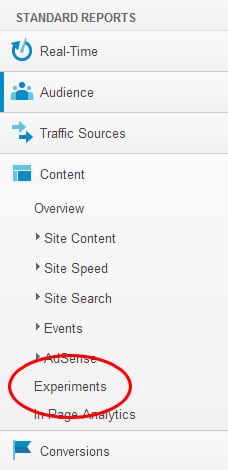
You’ll find the “Experiments” under the Content section within the standard reporting tab.

Google Experiments
When you click Start Experimenting, you’ll be prompted to enter a name for your experiment as well as the URLs for the two (or more) pages you want to test. Under Select an Experiment Objective, you’ll choose just which variables you want to test, after which you’ll determine the number of visitors you want to be your subjects.

A new Google Experiment.
A good rule of thumb is to choose radically different variables for the most robust results as opposed to those that are only mildly different. It’s also a good idea to funnel different tests to different kinds of users, and not to run tests on regular, loyal visitors who may be attached to the way things are.
Check and add code
Preview your websites and run the experiment.
From here, it’s all down to the numbers. Make sure you pay attention to statistical significance before making any big changes, that you don’t run your test for too long, and that you re-test regularly. Tastes, after all, tend to change.
Once you master the basics, I highly recommend reading this article of Search Engine Land for a more in-depth, creative, technical approach that will deepen the value of your metrics.
A few A/B testing case studies
Highrise
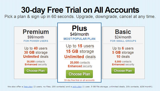
When 37Signals launched Highrise, they wanted to test the effectiveness of their signup headlines. One headline read, “Start a Highrise account,” and had a subheader of: “Pay as you go. 30-day trial. No hidden fees.” The second headline read, “30-Day Free Trial on all Accounts,” with a subheader of, “Sign-up takes less than 60 seconds. Pick a plan to get started!” After 3,000 views of these pages and several other test headlines, the results dropped off, so the experimenters pulled the plug at 4,000. The results? The second headline had a 30% higher conversion rate than the original. Now that’s a result worth learning.

37Signals testing the effectiveness of their signup headlines.
Medalia Art
Think a picture is worth a thousand words? That all depends on how many clicks and revenue it generates. With a good A/B Test of human versus objects and abstract images, Medalia Art, found out that human photos on a landing page increase conversions.
Distilled
We recently launched DistilledU – an online education portal for web marketing. While in beta, we played around with dozens of features, designs, focus points, etc. One specifically interesting data point was when we first launched the landing page, the “Enroll Now” button was written with the British spelling of “Enrol” – Within an hour we had received dozens of emails from our test participants notifying us of the “typo.” It can sometimes be the littlest details that make a huge difference.
Conclusions
A/B Testing is a powerful and essential approach for any website owner or marketer. After all, it’s just hard to know whether or not all of your efforts are paying off unless you’ve got the experimental data to back it up. As complicated as it may at first sound, mastering this approach will be worth it in conversions, revenue, and happy customers. So read up, pick your variables, and get going!


No responses yet to “The Importance of A/B Testing”