How to Practically Approach User Centered Design
Every designer faces three people that he or she needs to please – the client, the user, and themselves. Doing so is the perfect case scenario. But is it always possible? User Centered Design, in short UCD, is the principle created to put the user and their experiences in front.
An opposition to the constant corporate business goals, features directing towards sales, or other solutions that reach for our wallets. It is used to help with the project management and to increase profitability or user satisfaction. User Centered Design aims to design tools (websites, apps etc.) and products using the perspective of how it will be received by the user.
Users no longer have to adapt to a tool, but the tool adapts to users. Business goals, on the other hand, want to adapt the user to sales, and it’s not always parallel to UCD. Let’s discuss how to kill two birds with one stone and how to apply practical uses of UCD in the design of products, if it’s possible.
Common misconceptions about User Centered Design
User Centered Design appears to be user-benefit oriented and it faces several misconceptions. On January 9th 2007 Steve Jobs announced their three revolutionary products – iPhone included. Since that time Apple and terms such as UI design, usability, or user experience became a buzzing cloud every designer watched with sparks in their eyes.
Believing that User Centered Design gave rise at that time is false, however. Its beginnings go back as far as 1985, in the seminal paper by Gould and Lewis Designing for usability: Key principles and what designers think. The sights have been set on the users at that time, but the view was sometimes clouded.
Another misconception is equaling the term “interface design” with graphic design and other correlated, i.e. creating a sparkly layout with functionality added sometime later. Sophie Paxton in her article “Your UI is not a Disney movie” discusses the recent notion that various motion designers hop on the “UX” cart and produce fancy loading animations hoping their hopping dots will change the world of usability. They will not, because many designers assume a label without understanding the core principles of UCD.
The same people are responsible for the third misconception that interface design is not measurable, since it is subjective. Of course, the visual aspects are up to one’s tastes, but the effect it has through efficient information architecture and whatnot is indeed measurable. It’s actually what true UX designers do all the time – they study the effects on the user.
To discuss User Centered Design and business goals, one must understand the principles of both.
At UsabilityTools, our CEO Bart Mozyrko shows every new employee the same image: The Garett’s Model. He had shown it to me as well, even though at first I thought it’s something you use to dry your clothes on.
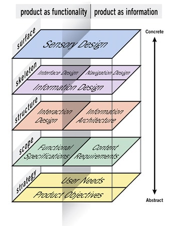
Garrett’s model – the answer to life
Jesse James Garret created a model that discusses the duality of the Web content and which clarifies the relations between various areas.
Even though it is related to the Web, I’ve been told that this is more or less an answer to life. It exposes the fact that every project has correlated layers, and that when you think about one of them, you need to foresee the influence it will have on the others. Butterfly effect, so to speak.
I had this model hanged on a corkboard somewhere in front of me when I was focusing on marketing activities. There were sometimes difficult situations. For example, when preparing a pop-up, I had to remember about certain factors:
- I want the users to sign up,
- but I want the users to have an unobstructed experience,
- yet I also want it to be pleasant looking.
When I presented my design to my supervisor, there was always this one “but”:
- ‘Yeah, it looks pretty and is easy to use, but no one will click it, because it should pop up in the middle of reading.’
- ‘What? But that will make people annoyed!’ I usually exclaimed.
- ‘Someone is bound to click it.’ was the final response.
Indeed, the work at the marketing team required many compromises. Even though I hated the bar at the bottom with a contrasting color and rocking button that ordered people to read the latest e-book, I knew that someone will click it and it will take me nearer to meeting the KPI’s for that week.
I despised the popup fearing that people will not read the articles I was proudly presenting. I loathed e-mail outreaches expecting return messages with “who the hell are you!?” I felt like a dishonest crook pretty much all the time.
I had enough of these compromises. I said stop to myself and decided that if I’m gonna do something, I’m gonna make my users happy. I’m gonna make the popups be the Mona Lisas of popups. I’m gonna make the e-book life changing. I’m gonna make the outreaches an actual conversation with a human being. I’m gonna focus on the users at all times and refine every layer of the activity I’m currently participating in.
I’m gonna become user centered in every aspect.
Practical User Centered Design Principles
I made a lot of mistakes and we learned a lot – mistakes I can be thankful for. At UsabilityTools, we changed our direction and created a product that is the best software for recording user activities on websites. Previously, I thought that meeting said business goals with user satisfaction was nigh impossible.
It is possible, but you need to adapt a particular model of designing to make the two work. Like Garett’s, this model can be applied in many areas.

Adapted from D.Wallach and S.C. Scholz User-Centered Design: Why and How to Put Users First in Software Development
The Scope
The first step is to determine the scope of your project and to optimize the factors that influence it. To be precise, it is about determining the goals of your project and the constraints that may influence your activities. Remember, the latter are up to the change, but in the onset stages you should be prepared for the most obvious possibilities.
Starting with goals, determine first what you want to achieve with your project. If it is an interface, establish what it should do, remembering at the same time to balance between visual and functional aspects. Your goals will determine the core principles of the rest of the project. Watch out for establishing too many goals, though – this will dilute the effectiveness of your work.
The constraints are possible obstructions during your project work. First you need to focus on the obvious aspects such as the medium, the dimensions, the software used – anything that will frame the project.
Delving deeper, the other constraints that you may face are user or supervisor’s expectations. Having a layout of these will immensely help you overcome possible obstacles before they occur. There is nothing more frustrating than stumbling over every single rocks when you simply want to finish that project once and for all.
Analyze
Analysis stage in short is the stage of analyzing the user. In the beginning you may make some assumptions, but later you should only gather hard data. Creating user personas, i.e. a model representation of your ideal user based on their interests, demographics, background, activities etc. is a good start. Gather data about your potential user base and analyze their behaviors.
This is also recurrent stage, which means after finishing a project you will come back here and start again. Once you’re done with your prototype or first draft, you need to return to this stage, analyze users behavior when exposed to your project, and reiterate.
There are several testing methods that you can use at this stage – card sorting, 5 second tests, eye tracking, you name it. They are an efficient source of data when it comes to your users. However, they are usually costly, because you need one ingredient: users. Even though the evaluation coming from these tests is very useful, it takes a lot of time and budget.
You can try heuristic analyses with specific guidelines set by usability principles to determine the effectiveness of your projects, but that is more often than not inconclusive. Our company, UsabilityTools, tried to cover that gap – time and money – by enabling our clients to record their users’ activities on a website or web application. This is done without intrusion and is dedicated to project leaders that want to analyze as many elements of their websites as possible.
Design
In other words, putting the project into reality. Since scope and analyze stages should provide you with enough data, there is not much to cover here, as there are many areas that are highly subjective.
It is up to you whether you want to prepare a full-fledged product or whether you want to start with wireframes and prototypes. One allows for quick Minimum Value Product release, the other helps in reiterating. All depends on the constraints you’ve established in the scope stage.
Validate
A similar stage to “analyze” – you need to validate whether the design you’ve come up with is fully effective. This can be done through checking the boxes next to the requirements you’ve set in the scope stage, through heuristic analysis or through usability testing.
I’d highly recommend going through verifying first your requirements (you’ve established them for something, after all), and then starting usability testing like it was mentioned in the analyze section. I assume that you’re already familiar with what usability testing is, but if not please head over this article from Thomas Churm that explains the basics of usability testing.
If it is a website or a web app, you may as well simply use UsabilityTools and start tracking up to 10000 user recordings per month. There’s a free trial, so any web designers can start that right away.
The problem with this stage is that often requires going back a stage or two, but all that is done to ensure that the end-product is of highest quality.
Deliver
Accept all stages and put your design into production. There are cases when a product is already in the delivery stage even before other ones, but it’s safer to go step by step through the abovementioned.
This stage also means going back to the scope. Reiterating, testing and improving your product never ends.
Closing remarks
User Centered Design is a keyword that glues to the back of our heads. Since it offers many benefits, it should be applied in every creator’s work, but more often than not it isn’t. That’s saddening, but the cause may lie in the fact that there’s some disdain for the “user”. After all, they aren’t always right, and they do not know themselves what they want. Do you know the Henry Ford example? People said ‘faster horses’, he gave them faster transport – what they truly needed.
User Centered Design is not as much about giving what people want, but it is about giving experiences that they would expect. So, be practical and meet user expectations – that’s my final piece of advice.




No responses yet to “How to Practically Approach User Centered Design”