Designing for Disaster
A plane crashes. A storm floods the land. A bomb explodes in a city. And with each of these catastrophic events, an ecosystem of victims, first responders, government agencies, volunteers, and other interested parties is created.
Everyone in this ecosystem has their own needs – victims need shelter, food, and water; first responders need maps and building plans; volunteers need supplies. But all share one fundamental need: the need for information.
Designing for disaster
Although the greatest need is to get help for those most affected by a disaster, once the immediate danger has passed, the need for information comes into focus. Victims need to know where to go to get food or find a place to sleep. They need to know which roads are open so they can evacuate. Their loved ones need to know how to find out if the victims are safe. First responders need to know where the greatest damage is, and whether they should focus on rescue or recovery. Government agencies need to share information with each other, with first responders, and with the public.
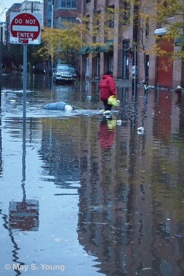
And as I discovered when my family went through Superstorm Sandy, these information needs are not always completely or effectively met, often because the entities that have the necessary information do not communicate it to the right people or in the right form.

Picture by May S. Young
In a way, then, disasters are an information architecture problem. Understanding the complex network of people and organizations involved in a disaster, listening to each entity’s needs, and improving the flow of information within the network is something IAs and UX professionals are well equipped to do. But so far, only limited work is being done in this area. Usability experts have helped to improve the government systems that help to get aid to victims, even in the US, where multiple, unconnected government agencies are involved in disaster recovery.
In the emerging field of crisis informatics, information professionals are working on efforts such as Ushahidi, a platform for sharing real-time, community-sourced information in a crisis, and Crisis Commons, which seeks to connect communities in need with tools, resources, and volunteers. But there is a real need for a UX design focus to make disaster-related information resources readily accessible and usable by the people who need them.
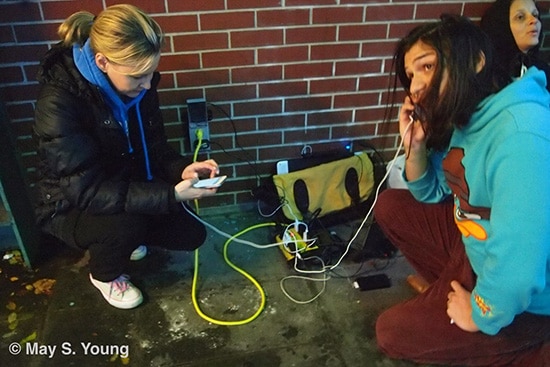
When my family lost power for 8 days during Superstorm Sandy, we struggled to find out when our electricity and heat might be restored. Our utility company gave us vague information that changed depending on whether we checked the website or called the company on the phone. The company worked tirelessly to restore power; what they neglected to do was to tell people when and where they were working. Eventually, the governor of my state ordered them to publish their work schedule, which they did…in PDF format. For people like us, sitting in dark homes and relying on the last bit of battery life in our phones, this was not a very useful solution. A UX designer could have helped the utility company present the information in a more appropriate way.

Picture by May S. Young
Information needs change over the course of a crisis, too. The victim who initially needed food and shelter soon transitions to needing to find out whether it’s safe to return to their home, or find out how to apply for aid to rebuild. People like me, who are less directly affected, go from wanting to find out when things will get better to wanting to know how to help others in greater need.

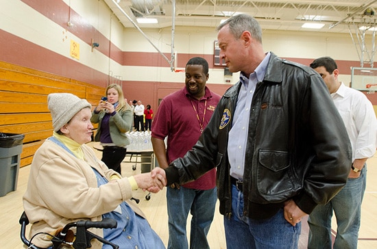
Picture by Maryland GovPics
Understanding the context of needs – the user’s environment, what sort of access they have, how great their need is, and where they are on the timeline of need – is, again, work that UX professionals are skilled at. We also bring empathy to the process, which is also a need shared by those involved in a crisis.
In an increasingly connected (and increasingly unpredictable) world, there is a reasonable chance that nearly all of us will have some brush with disaster in our lives. Design can’t improve the outcome of a disaster, and the user experience of a disaster is never going to be a desirable one. But as designers, we can and should help to improve the way everyone in the ecosystem – helpers and victims alike – prepare for, respond to, and recover from a disaster.


Insightful article, Amy.
Do you think if apply the “offline first” thinking the disaster use case would be addressed?
The reason I ask is because for most businesses, we make decisions based on the 80% use cases, not the edge cases. Naturally, a disaster would fall under the edge case category.
A disaster clearly falls under the extreme edge case category for most business, but for government agencies charged with disaster management, and for power companies and other service providers, it’s a crucial use case. For those entities, I’m not sure the “offline first” approach really works, especially in cultures where mobile device use is increasingly prevalent. That’s the area to which I think we as designers need to direct some attention.
Hope that at least partially answers your question, but please let me know if that wasn’t clear.
Yes I do agree with you. Recently we have a chance to work on designing a disaster management kit for individuals/families not only meant for survival but also to ensure they don’t loose any of their important document including identity documents which become very important to manage their life after disaster. This was done as part of USID Gurukul workshop which focus on collaborative and immersive learning experience.
Design is a critical tool for social development and making life of the people safe and better.
http://www.usidfoundation.org
Thanks for that link, Raman. The idea of a disaster preparedness kit for families is extremely important, and I completely agree that design has a major role to play in this kind of planning. I’ll keep an eye on the USID site for more info about the results of the Gurukul event.