Designers, Don’t Get Lazy
I just love WordPress, which is why I attended WordCamp in the Netherlands. This year was the 4th Dutch edition, for me the 3rd time to attend and the second time as a speaker. I decided to challenge myself and talk about design and how new innovations changed the role of designers.
I found a lot of inspiration on Twitter, where I joined a discussion about the changing role of designers and front-end developers within the web-team. A year ago I started this discussion at Amsterdam WordPress meetup because I was interested in getting to know someone else’s opinion as well.
The changing role of a designer
Looking back at the evolution of webdesign in the last 10 years, innovation gave designers new possibilities but has also restricted them in many ways. In 2006 I made a lot of websites with Flash. Flash meant no restrictions. I was able to use whichever font I wanted, placed design elements wherever I wanted. I could use video, sound and a lot of animation. Top of it all was that visitors accepted the fact that they saw a perfectly designed loading bar and waited for minutes before they could even enter the website. Using a grid was out of the question and we created everything in Illustrator or Photoshop. Those were the days :-) !

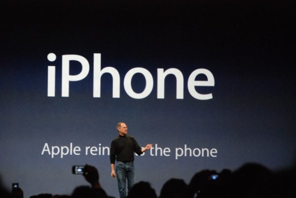
Steve Jobs presents the iPhone
But all great things come to an end. In 2007 something happened which changed the life of the web designer forever. The iPhone – and 3 years later also the iPad – meant somehow the end of Flash, because iOs didn’t support the Flash plugin. This was not the only change for the design process, it was merely the beginning.
With smartphones and tablets, people were able to visit your website with screens other than their laptop or desktop. The web had evolved, but what about the people who created things for the web?
In recent years, the amount of people visiting websites with a smartphone or tablet has increased enormously. People use devices everywhere, at the same time or one after the other. To create websites suitable for all these different screen sizes, responsive design had become the standard for creating multi-screen websites. Recently I found a great quote on the web:
“The web has always been responsive. It is us that stopped it from being so.”
We were responsible for limiting the web because of pixels.
What does this mean for the designers role?
During WordCamp I attended some other presentations and I noticed one thing in the presentations of the front-end developers: the irritation towards designers. Before the “responsive web design era”, the role of a designer was simple. You made a sketch in Photoshop or Sketch, with pinpoint accuracy. When finished, the front-end developer translated this into code. Nowadays you have to create a design for desktop, tablet, mobile and maybe 2 other sizes. Elements will shift, influencing the readability.
This actually requires a complete different way of working. A developer made a nice remark during his presentation : “Fuck the designer”. And even though I have been born as a designer, I could not help it to agree with him.

Responsive design
Responsive design still sounds a little bit scary for us as designers. Maybe even feels a bit restrictive. It’s like you need to give up your recent acquired freedom due to technical changes and improvements. Although you know that the majority of visitors still visit your website with a laptop or PC, you should still create for the small screens as well. Two years ago I was thinking the same way and wrote an article, titled “Is Responsive Design a Hype or a Solution“.
Now I know that this was just something in my head. It’s a challenge to create something fitting for all screens and has a perfect user experience.
I’ve lost my pixels
I must admit that I am a designer with an unhealthy interest in code because I had to learn html during my first job. When I started with responsive design, I wanted to have the freedom to determine what would happen with my design on a tablet or smartphone.
Apple and Microsoft started a new trend for today’s design: “flat design”. As a result of both responsive and flat design, the need of Photoshop slowly disappeared. So I switched to Illustrator and from there on I continued designing into the browser.
I’ve lost my pixels.
After saying “Stop using Photoshop” during my presentation, I saw a few people turning a bit pale. Use Photoshop for what it was made for: post processing of pictures.
Surely, not everybody loves Illustrator. I used it during my time as a Flash designer – Flash being a vector based program just like Illustrator – but the web is constantly changing. The use of SVG vector files has increased enormously. Why would I create a double sized retina design in Photoshop if Illustrator is scalable?
Not every designer is able to make that step towards browser design or to let go of Photoshop. Same thing goes for front-end developers, who do not have the same eye for details as designers do. Therefore its very important that traditional designers take a look at his/her own role within the web team. It’s necessary that we, as designers, know the restrictions and possibilities of the current technology. The role of a designer has changed. It’s more than only creating a nice sketch. We need to understand the fact that functionality is perhaps more important than your creation.
The web doesn’t consist of pixels
More and more browsers support things like CSS3 and HTML5, giving us more design possibilities. Don’t lay back in your lazy chair until you hear the news about stopping IE8 support. Make your front-end developer happy and don’t just throw things over the fence to him. Let go of pixel-thinking and take the web as it should be: a free form.
Comments
I saw quite a few mentions on Twitter from people who had attended my presentation. They made a bit fun of me and even called me the Photoshop killer. I knew that I was going to hit some designer’s nerves when I said to stop using Photoshop. When I later stated that they should even start coding… ouch. To me, finishing a design in the browser is fine.
Most of the time, I start designing in Illustrator. I create one or 2 sketches, see how they respond to other screen sizes and then code it with the help of a browser. But I have to admit that I have this freedom because I know damn well how to code CSS and HTML. For the majority of the designers, coding could be a worry because they don’t know all ins and outs.
I achieved what I wanted with my presentation. People started to think about my story. My full presentation (in Dutch) can be found on SlideShare.


No responses yet to “Designers, Don’t Get Lazy”