The Dark Patterns of a Webshop
Special offers that can expire at any moment. Little extra’s getting into your shopping cart without asking. A ‘free delivery’ option, which in fact is a hidden subscription. New research has mapped these little tricks. They are being called “Dark Patterns”.
These manipulative techniques, often on the edge of being illegal, are being used to push you in a certain direction and making decisions you didn’t want to make in the first place.
Researchers at the University of Princeton have listed the most commonly used techniques, and classified them into seven categories. Then, using an automated system, they checked 11.000 webshops.
The result: 1.841 examples were found using these techniques, 11% of the websites use one or more of them. On 183 websites (i.e. less than 2% of the investigated sites) there was a real fraud. However, researches said that those numbers might well be higher, since their program is bound to miss a few examples.
The researchers also revealed how those tricks make good use of cognitive bias: is a systematic error in thinking that affects the decisions and judgments that people make.
A typical example of cognitive bias is anchoring: if you first see a high price for a certain object, then every lower price seems to be a bargain. This techniaque is also called the decoy effect. Restaurants apply anchoring by putting a super expensive bottle of Chateau Lafite on their wine list; webshops will pre-select the most expensive variant of a product.
These are the seven techniques that the Princeton researchers list:
Dark Pattern #1: Sneaking
Additional items are secretly placed into your shopping cart, or at the last step there is a sudden ‘processing cost’. Or you are even lured into a subscription system.
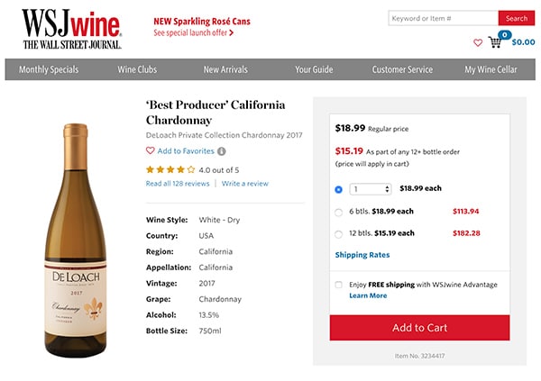
The researchers found 26 examples. An example from the study is the wine site WSJwine.com. ‘Enjoy FREE shipping with WSJwine Advantage’ can be checked when you place your order, but nothing tells you that this is in fact a paid annual subscription. Only way to found out is to click on the ‘find out more’.

Dark Pattern #2: Urgency
The customer is being put under an artificial time pressure. Often with an actual counter that counts down how long a certain special offer is still available. Sometimes with the unclear message that the offer is only ‘temporary’.
A total of 483 examples were found. On 140 websites of those, ‘temporary’ offers were still available afterwards.
Dark Pattern #3: Misdirection
You are pushed to a certain ‘optional’ choice and kept away from other choices. A technique commonly used is confirmshaming: the choice that is less interesting for the seller is given an unflattering description.
For example: you can refuse an annual subscription by ticking the box ‘No, I prefer to pay the full price’. This specific technique was found 169 times. Or sometimes the description is deliberately confusing. For example, you think you’re unsubscribing from email marketing, but actually you’re doing the opposite. One way to achieve that is by using a double negative in the description.
In Europe, such dark patterns are contrary to GDPR legislation.
Dark Pattern #4: Social Proof
A much used form of cognitive bias is that we often make the same choice as what ‘the others’ or ‘the majority’ do. Websites can manipulate this with messages about what the ‘most bought’ variant of a product is – who will say if that is true?
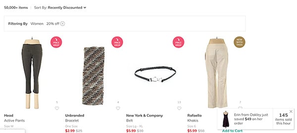
They can also give the (misleading) impression that a lot of people are shopping. A certain website, Thredup.com, is constantly showing reports like ‘Abigail from Michigan has just bought a new stereo’. These notifications are automatically generated from a limited list of names and objects.

Another example is Booking.com. They are known to use some of these dark patterns, admittedly not as sneaky, but they seem to be using real data although not verified.

Dark Pattern #5: Scarcity
Hurry, there are only two barbecues left! This dark pattern uses the scarcity bias: what is rare seems more valuable. More than 600 webshops use this trick. On 17 websites, the researchers were able to demonstrate that the messages are purely fictitious: automated scripts invent the stock level. Such software is simply for sale.
Dark Pattern #6: Obstruction
Subscribing to a service, such as a subscription with free deliveries, is easy. Cancelling that service is often more difficult, if not impossible: you have to search deep into all kinds of menus or call a special telephone number.
Dark Pattern #7: Forced Action
Going through all necessary steps to find out you need to create an account or share your information, or you will not be able to complete the order.
Conclusion
The Princeton researchers found out that websites do not have to build in such tricks themselves: there are service companies out there that offer these dark patterns. The study found 22 companies that can, among other things, cause false purchasing activity on your webshop, even though according to the researchers this is illegal in both the US and Europe.


No responses yet to “The Dark Patterns of a Webshop”