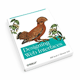
A Book Review of Designing Web Interfaces
What can I tell you, I just love to read about web design. Because I could spend a small fortune on UX books, I find it very useful to read a few reviews before I actually buy a book. Instead of spending my time looking for the next purchase, I thought I’d write a review for a change.
I chose to review “Designing Web Interfaces” by Bill Scott and Theresa Neil. They have been working for companies such as Sabre, Yahoo!, and Netflix and have a good amount of years of experience divided between them! I was very curious about their book, to say the least.
What is this book all about
Let me tell you from the start that Designing Web Interfaces is not just the next collection of web interface patterns. Instead, the book really tackles the challenges designers encounter daily when designing user interfaces, and categorizes the recommendations into six design principles:
- Make it Direct
- In-Page Editing
- Drag and Drop
- Object Selection
- Keep it Leightweight
- Contextual Tools
- Stay on the Page
- Overlays
- Inlays
- Virtual Pages
- Process Flow
- Provide an Invitation
- Static Invitations
- Dynamic Invitations
- Use Transitions
- Traditional Patterns
- Feedback Patterns
- React Immediately
- Lookup Patterns
- Feedback Patterns
By using online examples of both well-known and smaller websites, Bill and Theresa objectively explain both the positive and negative impact on the user’s experience of each solution and provide us with tips, ideas and best practices.
Positive
Designing Web Interfaces comes with an abundance of screenshots, so the story is not left to your imagination. Wherever an example pattern requires several steps and some kind of interaction from the user, multiple screenshots make the functionality of the pattern clear to the reader.
The book has many user interface patterns to show, but you just can’t compare it with normal pattern collections. What I mean is that you can’t turn the pages, find the pattern you need, compare it with alternatives and implement it into your project. Instead, Bill and Theresa describe both the advantages and disadvantages of well-chosen user interface patterns and back it up with their many years of experience. For example: the different stages of a drag-and-drop pattern are explained in 34 pages, where each stage of interaction is carefully explained with text, plenty of examples and screenshots.
Negative
Although I find it very useful when a pattern is described in detail, personally I think Bill and Theresa overdid it a bit by highlighting these details too much, making the book a tad repetitive. Or maybe my expectations of the book were different.
Conclusion
Other than these little shortcomings I can only be positive about the book and think it should be on every web designers’ bookshelf. Not only is it well written and a smooth read, but it is also a nice encapsulation on many of the latest UI trends for web and desktop applications.
Did you read the book? Let me know what you liked about it!
This article was also published as a guestpost at Nomad Chique.
Designing Web Interfaces: Principles and Patterns for Rich Interactions – by Bill Scott and Theresa Neil
A great book that explores all kind of interface patterns into detail. Really usable material for interaction designers.
More books
“Designing Web Interfaces” is not really your cup of tea? No problem. I have collected some of the best UX books in one post. I’m sure you’ll find something to your liking.


No responses yet to “A Book Review of Designing Web Interfaces”