6 UX Design Techniques That Really Work
It is easy to underestimate the importance of someone’s first impression. Judging by our feelings concerning a person’s appearance, clothes, speech, and other factors we are realising whether this person is interested in us or not.
Of course, further communications can change our minds. However, this example is not exactly suitable for the field of IT. Users will not continue using your app if they are not satisfied with its design or usability. They just have no reason to do so. Why? Because the market has hundreds of analogous apps.
That’s why design is one of the key components to your success on the IT market. It helps you not only to present your app’s functionality correctly, but also to deliver new user experiences. That’s where UX design techniques come into play.
The mobile app design is an integral component of a long-running interaction between consumers and products. The achievement of high-quality design demands using certain techniques. These techniques are the result of experience and the hard work of designers all around the world. In this article, we are going to discuss some of these design techniques.
Personas
Creating an app is very similar to creating a business. First of all, you should investigate and choose a target audience for your product. Quite similar to a business plan, isn’t it? However, when defining your app’s target audience, you should use a bit of imagination.
Your task is to create a fictional character – a persona. This persona should be created according to the data you have received during the analyzation of typical users.
Why do you need a persona? The answer is simple. For defining the common needs and expectations of your potential consumers.
Personas can be characterized by some of the following features:
- Person’s origin
- Skills in digital communication
- Expected pros and cons during the app usage
- Preferences in digital interaction (apps, devices etc.)
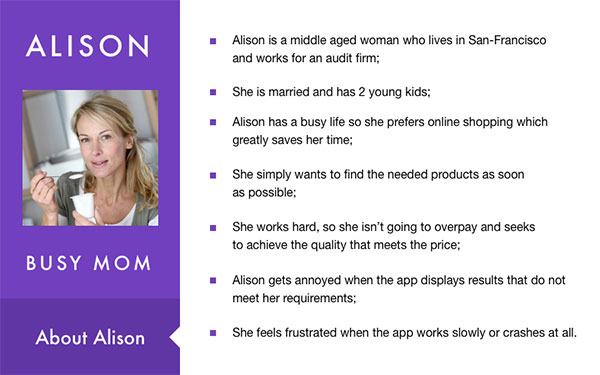
So, a persona helps you look at the app from a different point of view, namely your customers’. This way, you can better understand the needs and desires of your app’s potential user. Underneath, you can see an example of a typical persona.
So how do I create personas, you ask? You should concentrate your efforts on the psychological creation. However, you should not create it for each consumer separately. You need to single out 2 to 3 social classes with their representatives. These groups will be your focus.
For example in e-commerce, it’s important to understand that a persona might be a busy man who has no time for shopping. Another persona can be a senior citizen for whom it is easier to do their shopping at home. Your app should be convenient for both of them. So your interface needs to be fast and simple. This way, busy men do not spend a lot of time making an order and senior citizens do not become confused because of the complicated app interaction.
Editorial note: Trying to find out how to create personas in more detail? Then you should definitely read “The User is Always Right” by Steve Mulder.
Make sure you can trust collected information
We found out, for the perfect design creation, you should clearly imagine a character who is willing to use your app. It is a good idea to present your persona to relatives or friends whose lifestyles are similar to your target audience. You will probably get good advice to improve your character.
Sort out your information
Surely, you will run into a lot of details concerning your character. You will learn about his favorite color, food, his passion for moonlight walks etc. All these details should not throw you off. You need to be concentrated on those details which can be useful for your product. Always ask yourself “If I was a consumer, would that be important to me?”.
Written description
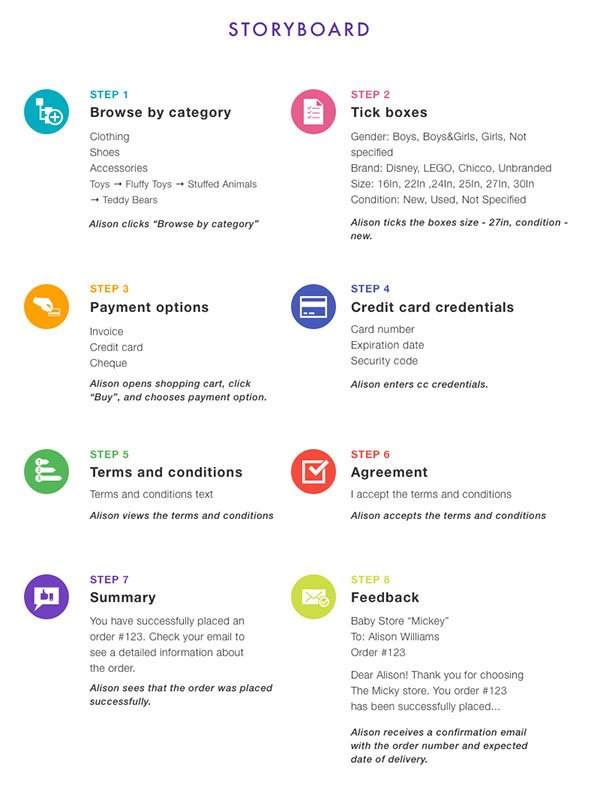
This technique includes stories, scenarios, and storyboards. It helps to describe a separate action or a chain of actions in your app. In other words, the story is a general description of an action needed to be done, scenario – more detailed description of that action, storyboard – provides a schematic image with a visual demonstration.
Story: “Alison is going to order a bear for kid’s birthday”.
Scenario:
- In the evening after work, Alison has time for ordering the present for her kid.
- She lays on the couch, takes her tablet, and opens a shopping app specialised in kids stuff.
- She knows for sure the goal of her shopping, so she selects “Browse by category”. (Toys → Fluffy Toys and so on)
- etc.
Storyboard:
Design starts on a piece of paper
Before designers are allowed to enter the room with computers and professional graphic software, they usually do some paperwork. No, it is not a misprint. Designers need to make a sketch of an app on paper. Then, they usually give the main function’s description in written form.
Also, in order to understand the way of further app’s design development, the designer should answer several questions. If we are talking about the website or app from scratch creation, the questions might be the following:
- What is the distinctive feature of this client?
- Why did they decide to make this product?
- What problems do they want to solve by releasing this product?
- How can you present your ideas to users?
In case you are making an app or website based on the sample given by your customer these questions are:
- Is everything logically arranged?
- Can users find elements fast and effortlessly?
- Does it look modern and clear?
- Which changes can you make to improve the existing design?
Mind map
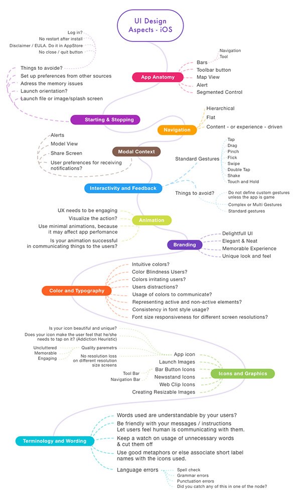
This technique is widespread in fields that demand deep thinking and the creation of various ideas. Mind-mapping helps to arrange gathered information into a single visual result. It is a really convenient way of gathering information when it comes to storing numerous ideas and choosing between them. This way, ideas will not slip your mind and will be arranged in a convenient way for further use. With the help of this method, you can direct your UX’s thoughts in the right direction
Note that mind-mapping is not the final product. It is the provisional sketch of a product that designers can use to coordinate their thoughts more conveniently.
Here is an example of mind-mapping in a mobile app:
Wireframing and Paper Prototyping
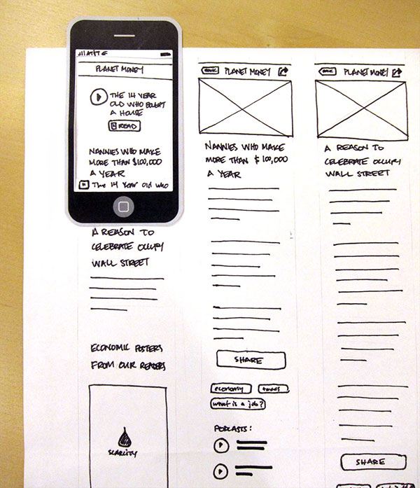
A wireframe is the first digital sketch of your product. It shows how different elements in your app are placed and how they interact with each other. Put simply, it is a plan for your application or website. With a simple wireframing tool, you create the static picture of your app’s complete layout. It is a frame of the future app. Nevertheless, this frame has a long way to go before becoming the product’s ready design.
Paper prototyping is a great way to show your customer how the final product will look and function. During a paper prototype creation, you do not need any special skills such as CSS and HTML. Also, you do not need special software, just hands and some stationery.
User Testing
The best way of testing a product which is being made for users is involving them in this process. Before sending your design version to production give them an opportunity to use it. As you know, users are the strictest judges and if there is something wrong with your design, you will get immediate feedback.
Of course, the period of testing and the number of participants depends on the project’s complexity and budget. Also, you can use moderated or unmoderated testing.
Moderated testing
Moderated testing is a process where you give the instructions for particular features being tested. In other words, you coordinate user’s actions.
Advantages:
- You can observe user’s emotions and reactions
- You have real-time information concerning this process
- You control the testing process and you can check on questionable features
Unmoderated testing
Unmoderated testing means that users test your product by themselves. This process does not need any intervention.
Advantages:
- You save your time
- You can test features you did not even think about
- You get test results from a natural environment
Do I have to use each and every of these design techniques?
Actually, customers and users do not care what kind of design techniques you are using during your project’s creation. The only thing they care about is the final quality of the product. It’s up to you to decide which technique to use or not to use. Everything depends on your skills and preferences.
The more you work, the more accurate your decisions will be. Professional intuition will give you the right hints.
These techniques do take some time to master and apply into your daily work. However, if you’re looking for some quick wins to improve the user experience, we do have an article about that as well. Enjoy the reading.



No responses yet to “6 UX Design Techniques That Really Work”