3 Tips for a Better Mobile UX
The mobile user experience is about more than having a site that is responsive to multiple devices and platforms. Mobile behavior is fundamentally different from desktop behavior and designing an experience for the mobile user journey is beneficial to businesses that want to increase sales, growth hack their user base, and foster brand loyalty.
According to Adobe, mobile users are 5 times more likely to abandon a task on your site if the site is not optimized for mobile. And according to Google, “If your site offers a great mobile experience, users are more likely to make a purchase.” But truly optimizing a site for mobile is not just about making your regular site look good on mobile devices.
Users want and expect sites to anticipate their needs and mobile behavior and to serve their micro-moments. In fact, a Forrester study concluded that 62% of US adults browsing online from their mobile phones assume they will land on mobile-friendly websites, which provide a more enjoyable user experience, and 23% expect their mobile experience to change based on their physical location. Google tells us that “Micro-moments occur when people reflexively turn to a device — increasingly a smartphone — to act on a need to learn something, do something, discover something, watch something, or buy something. They are intent-rich moments when decisions are made and preferences shaped.”
So, how do you take your site from simple mobile responsiveness to real-time mobile relevance? Here are 3 tips to create a better mobile UX:
1. Enhance the User Journey
By accepting the journey that the mobile user is on and seeking to understand and serve the users, take on their goals as your own. Experiencing mobile UX through the lens of a mobile user allows you to shift your focus from accomplishing your goals to assisting them in accomplishing theirs. A common example is the Call to Action button.
A website’s goal may be to complete the sale as quickly as possible once a user has shown intent. Therefore, after a user clicks “Add to Cart,” a site may take them to the next stage in the checkout funnel. However, in the mobile experience, the user may not be ready to complete this final stage of the buyer journey and will prefer to save the item in the shopping cart in order to review it more thoroughly on his PC at a later time, and only then complete the purchase.
Instead, some mobile sites are enhancing the user journey by giving users options for the next step after clicking “Add to Cart.” As opposed to taking users directly to the checkout, HomeDepot.com, for example, offers four selections:
- Checkout now
- Check out with PayPal
- Continue Shopping
- View Cart
Also read: How to Reduce Your Online Shopping Cart Abandonment
2. Make it easy to complete a sale
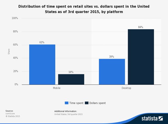
It is true that most mobile shoppers do research on their smartphones and complete sales on their desktops, as shown in this chart by Statista:

Distribution of time spent on retail sites vs. dollars spent in the United States as of 3rd quarter 2015, by platform.
While you should be cognizant of the fact that mobile users may not be ready to complete the sale and should foster their journey as they intend it, when they are ready to buy, you must make sure the experience is frictionless and pleasant.
The mobile experience should be a positive one, even if it does not conclude with a sale. Studies show that a negative mobile experience impacts brand loyalty. Digital Marketing Magazine reported that “nearly half of mobile users have ditched a brand completely following a poor mobile experience.”
Here are some tips for making it easy for mobile users to complete a sale:
- Regardless of the number of items in the cart (especially relevant for carts with many items), make sure that the total amount and “Proceed to Payment” CTA are always visible as a sticky element on scroll.
- Be careful with having a promo code field open by default as it tends to cannibalise the main CTA.
- Offer payment options via a secure mobile wallet like Apple Pay or Google Wallet.
- Provide security reassurances, because many users are wary of online purchases due to concerns about their privacy and security.
- Improve readability: Make all text large enough so users do not have to zoom in.
- Optimize load times and make sure all UI elements are quick – anything that slows down the process should be considered for elimination
3. Be Social and Play
According to SocialMediaToday, nearly 2 billion people use their mobiles for social media platforms. Leverage this by empowering users to combine their social media obsessions with their interaction with your site.
Optimize your user experience to account for this by:
- Enabling users to log in to your site using Facebook, Gmail, or LinkedIn
- Placing sharing options to popular social media platforms
For example, Groupon leverages social media by both allowing users to sign in through their social media profiles and easily allowing them to share deals with their networks.
Enabling social networks is common growth hacking principle. Encourage your mobile users to link their social media accounts, share their conversions, and review your business on third-party sites. The more of these social brand advocates work for you, the more traffic and sales you will see.
According to Business Insider, “gamification represents the fusion of four trends: the explosion of social media usage, the mobile revolution, the rise of big data, and the emergence of wearable computing.” Optimizing mobile UX, in many industries, can be catapulted with gamification techniques like NikeFuel on Nike+, America’s Army for the US military recruitment, and Autodesk’s Undiscovered Territory.
Adding rewards, points, and other elements of gamification into your mobile UX may give you an extra push over competitive hurdles.
A new approach to a better mobile UX
User experience cannot exist on a single device. You cannot optimize only for desktop users nor should you solely on mobile. The user journey is progressively becoming a multi-device (and, in some cases multi-platform) experience, and you must study user behavior, understand user needs and pain points, and find innovative solutions through UX optimizations.


No responses yet to “3 Tips for a Better Mobile UX”