12 Tips to Improve Your Usability Testing Technique
The article titled ’12 Tips to Improve your Usability Testing Technique’ was originally and in full length published at Walkme.
Usability testing is a technique used to evaluate a product, such as an application, website, book etc. by observing people using it. The goal is to discover usability problems, collect quantitative data (e.g. time on task, error rates), and determine the participant’s satisfaction with the product.
In this article I’ve gathered 12 tips to sharpen your Usability testing technique, which is key to discover more errors and areas of improvement in your product.
1. Setting clear criteria for participant recruitment
Recruiting the right participants is key for effective user research, because your research results are only as good as the participants involved.
You should deny participants who have conflicts of interest (working for your client or competitor), who have inappropriate computer and Web experience (too little or too much experience unless it is appropriate for the project) and those who are not very expressive.
2. Amount of participants
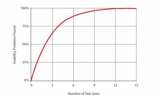
A long time ago (2000) Jacob Nielsen wrote that only 5 participants are necessary for a valuable usability test and that the gained insight diminishes rapidly after the fifth.
Usability.gov determed this number with the help of a formula, which is not that different from Jacob Nielsen’s number.
Usually 3 to 5 respondents per round are enough to encounter many of the most significant problems related to the tasks you’re testing. It’s pretty much a certainty that you won’t uncover some of the serious problems in a given round of testing. That is why you’ll be doing more than one round.
Amount of Participants - As soon as you collect data from a single test user, your insights shoot up and you have already learned almost a third of all there is to know about the usability of the design.
3. Mention your objectives clearly to the user
Put the candidates at ease and run them through the software tools and equipment. Explain the objectives of the test, how long it will take and how the gathered data will be used.
Inform the participant that you are testing the product, not the participant’s skills. Respondents have a tendency to attribute failure in the task to their own incapability, rather than a flaw in the design. Tell them they can’t do anything wrong. In fact, the more mistakes they’ll find while testing, the better. Stress this point more than once so test participants understand it clearly.
4. Choosing tasks carefully
Set tasks that are essential to the success of the new website or application, such as buying products, paying bills or contacting the client. If these ‘top-tasks‘ are not clear to you, you could always ask the client which questions your research will need to answer.
People also tend to perform more naturally if you provide them with scenarios rather than instructions. Instead of asking them to find the contact section of your application, you could phrase it like a scenario. For example: “You fell down from the stairs and had to call the ambulance. You’re wondering if your medical insurance is covering this and would like to contact them – Find the telephone number”.
A scenario provides some context and supplies information the user needs to know, but doesn’t (e.g. username and a password for a test account). It’s important not giving away any clues in the scenario.
5. Ask your respondents to think aloud during the test
Think-aloud protocols, or TAP, involve participants thinking aloud as they are performing a set of specified tasks. Ask them to say whatever they are looking at, doing and feeling as they move through the user interface.
This method has several advantages. You’ll know what your users really think about the design which could turn into actionable redesign recommendations.
For the full article, please visit the original publication at Walkme.
Some useful resources
Books:
- Rocket Surgery Made Easy: The Do-It-Yourself Guide to Finding and Fixing Usability Problems – by Steve Krug
- Handbook of Usability Testing: Howto Plan, Design, and Conduct Effective Tests – by Jeffrey Rubin
- Measuring the User Experience: Collecting, Analyzing, and Presenting Usability Metrics – by Tom Tullis
- Other related books
Internet:
- Five Second Test – Landing page optimization for your mocks and wireframes
- User Testing – “The fastest, cheapest way to find out why users leave your website”
- Chalkmark – Online Screenshot Testing Software
- Silverback – Guerrilla usability testing software for designers and developers


No responses yet to “12 Tips to Improve Your Usability Testing Technique”