10 UX Design Trends for App Designers
Last year 2014 was a big year for the experience design with more adaptive and responsive designs, and this year is even bigger. This is so because the UX (user experience) design is sinking deep into products, companies and even in the lives of users who interact with the design.
The products and services that are easily usable, impressive and offers valuable benefits make the most preferred choice for obvious reasons. This certainly creates a rise in the demand for customer-centric designs to ensure a surefire success of the product in this wobbly marketplace. Thus, it can be said that UX is not just about the usability or the appealing appearance. But, the UX design has substantially evolved as an emotional design that embraces user behavior.
Although many companies understand the need of remarkable UX design, only a few are able to make out what it actually entails. This article will unleash some basic and advanced UX design trends that can help application designers to deliver an incredible application.
Here are the worthwhile app design trends considering which you can design an intuitive, intriguing and enticing user experience.
1. Ensure Complete Security And Privacy To Users
With the increasing cyber-security issues, the data privacy and security concerns are rapidly growing among users of apps that consume sensitive user info, like a financial service app, digital wallets, etc. The researches have also shown that more than 60% of application users are conscious to learn the way their critical info is being used in an app. In fact, over 40% of users refrain to download an application due to the security concerns.
To efficiently deal with such issues, it is advisable to consider a standard security model while designing an application. You can share some info, including the type of data (like device ID, contacts, location, etc.) that the app will access. By giving a clear picture to users, you can win your target audience’s trust.
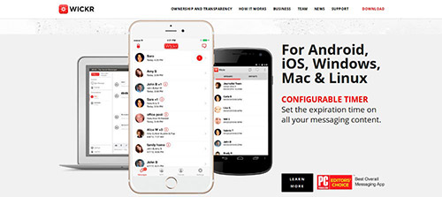
Wickr is a messenger application that implements security and privacy features by offering a secure environment to interact with others. It also enables its users to set a desired time for all their messages to get expired. And, it automatically eradicates the crucial info, like identifying data and Geotags, from messages and ensures better privacy and security.
2. Integrate Potent Microinteractions
Microinteractions can be defined as the interactions that surround a single use case, as they are meant to perform a particular task. Since, UX includes the sum of experiences while interacting with all the tasks integrated in a simple or complex application, micro-interactions are incessantly becoming more significant. They can influence users’ perception and thus, impact the application’s success.
By keeping the factors that can stimulate the user interactions to stack-up and considering subtle strategies to deliver an engaging and delightful design, you can create a fruitful UX.
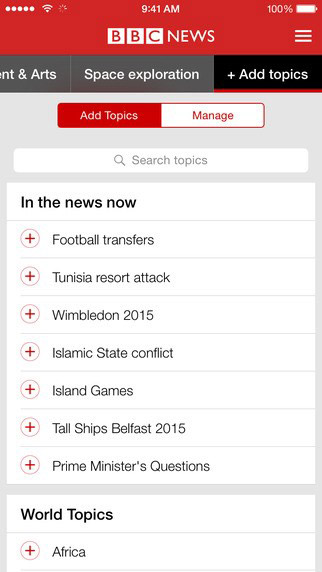
Today, there are several apps that follow this trend, and BBC News application for iOS users is just one of them. This application boasts a fabulous design with suitable microinteractions. It ensures that no user miss any information unwittingly. This way, you can enhance the UX design by embedding suitable microinteractions in it.
3. Including A Walk-through Can Do Wonders
While improving the usability of an application, we often end up with a complex interface that displays a number of buttons, content and tools.
Fortunately, this issue can be efficiently addressed by demonstrating the functions of an application via a suitable walk-through. You can showcase the features of your application in an intuitive fashion by offering easy-to-read and understandable walk-throughs. Moreover, while streamlining the user experiences, an app walk-through also creates a pleasing visual experience that can compel users to return.
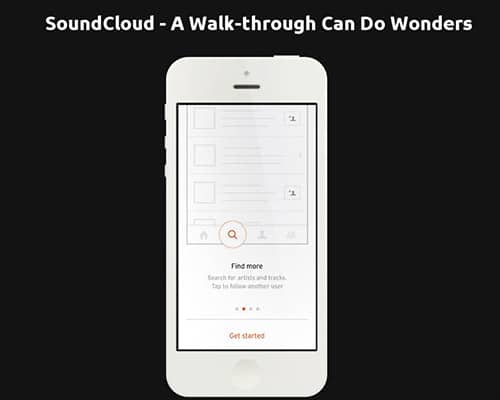
SoundCloud offers a great way to showcase a walk-through in an application. It features a captivating walk-through that offers a brilliant way to make it easier for users to get started with the application, and reap its benefits. This walk-through certainly modernizes the intuitive and intriguing appearance of the application.
4. Transition From Sticky UX To Slippy UX!
Today, creating a sticky UX to keep users engaged for longer is no more a viable design approach, as slippy UX delivers outstanding performance.
But, what is slippy UX?
Slippy UX can be defined as overhauling the design in a manner to deliver smooth user interactions and experiences by augmenting invisible experiences. Since, this design methodology helps develop apps that don’t deviate users to extraneous things, it heightens the app’s usability. Furthermore, as IoT (Internet of Things) is all the rage today, designers are increasing adapting the slippy UX design.
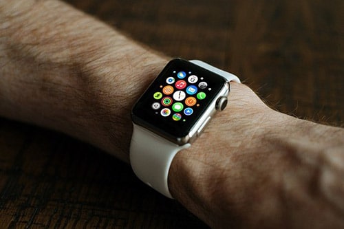
Slippy UX will surely help you keep your users connected with your app for longer with a smooth and highly interactive interface. Smart Watches offer a valuable example, that implements Slippy UX. It embraces small and remarkable interactions. For instance, it can notify users about the missed call via vibrating, without ruining their analog experience.
5. Reap The Benefits Of Social Media – For Simple Logins
Instead of designing a complicated and tedious login form in an application, filling which could turn out to be an arduous task, it is viable to integrate the social media login feature. It will help you keep user frustrations at bay and control the app abandonment rate. By including the social media login facility, you can efficiently scrutinize the login process, while making it much simpler and time effective for users.
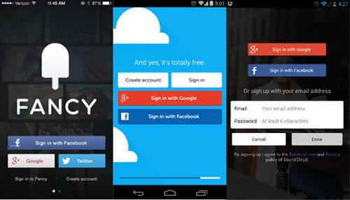
Fancy is a beautiful application that is quite similar to Pinterest, the only difference between the two is that you need 'to Fancy' the desired items instead of 'pinning' them. This outstanding application allows one to log in via a desired social networking account like Twitter, Google+ and Facebook, while also offering a regular way to sign in.
Continue to the next page for 5 more UX Design trends.





Interesting read. I liked the microinteraction part the most. I also wrote a piece about an upcoming trend, the new role designers play in product teams: https://uxstudioteam.com/ux-blog/ux-design-trends-2017-next-big-thing-design/
Thanks for sharing David. Great article by the way!
Hi Addison, I was looking for some content inspiration on the latest UX design trends in the last five years. I came through the post and I found it really useful for me. I have also created a fresh piece of content with detailed suggestions of an expert teammate who is ux designer. You can read here: https://www.netsolutions.com/insights/10-ux-design-trends-to-look-for-next-year/
These tips are just excellent, but an app designer will have to come with new and innovative ideas rather than looking at one direction. Thanks for sharing such great post.